Maps Are Useful, But Can Be Misleading
Reflections
BY EDWARD L. PECK
World Map – Mercator Projection – from 1569. This version produced Mark Lane and MapLink. © 2005 ODT Maps, https://ManyWaysToSeeTheWorld.org
Work in the Foreign Service, dealing with U.S. interests, objectives and activities all over the world, derives some utility from knowing what our three-dimensional Earth really looks like. It cannot be reproduced with anything remotely resembling accuracy on a twodimensional piece of paper, but awareness of the problems resulting from the effort to try can be useful.
My interest in maps, which has become a bit of a fixation, began in the fifth grade, when I asked a teacher how Australia, which the map showed as a rather small South Pacific island, could be ranked as a continent. We went down the hall, and for the first time I saw a globe. It revealed that Australia is in fact an extremely large island, and merits the label. But I was puzzled: why the visual disparity? I have since learned.
Flattening Earth’s image requires that parts of it be extensively stretched, in width and height, resulting in four highly significant distortions: size, shape, direction and distance. The larger the area covered, and the farther it is from the equator, the greater the distortions (especially east-west). Consider this: the North Pole, which is a point, appears on a map of the world as an area that is 24,000 miles wide—that’s the length of the equator. This explains why Greenland looks huge: It really isn’t.
Americans, who have been raised with and rely on Gerardus Mercator’s 16th-century map, are not aware of how inaccurately it presents the world. For example, the distance from Tokyo to Singapore is actually 210 percent longer than from London to Moscow; yet is only 10 percent longer on the map, because Tokyo-Singapore is more vertical, more north-south, and closer to the equator. London-Moscow is horizontal, more eastwest, and farther from the equator.
There are additional issues, one of which is to accept memories of what we have seen as representing reality. The United States and Russia are only 55 miles apart in the Bering Sea, but are widely separated visually on most maps. Santiago, Chile, is actually farther east than Key West, Florida.
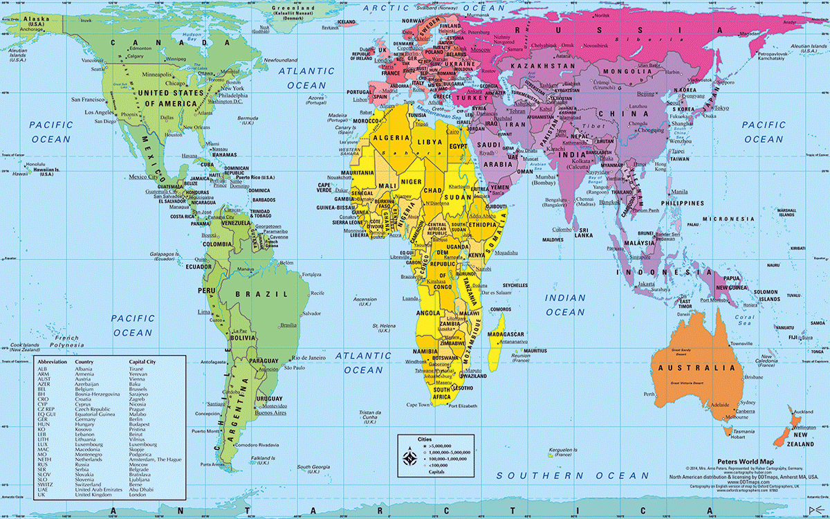
Peter’s World Map © 2017, Majenna Peters. Reproduced with permission of ODT Maps. https://ManyWaysToSeeTheWorld.org
Going through the Panama Canal from the Pacific Ocean to the Atlantic, your ship is actually traveling northwest. The last state you will fly over from Miami to Tokyo is Alaska, on a Great Circle route, since you cannot do it on a map’s straight line.
The distortions are amplified in the Mercator projection map. Because the equator is far below the middle of the Mercator map, the relative size of the Southern Hemisphere in comparison with the Northern Hemisphere is greatly reduced: Europe looks as large as South America. In addition, the 70 percent of Earth’s surface that is water is crammed into a much smaller area.
The Peters projection map—also known as the Gall-Peters projection (named for the two men who helped bring it to prominence, James Gall in 1855 and Arno Peters in the early 1970s)—deals with some of these problems. The Peters projection map shows each country in its correct relative size. It is still a two-dimensional projection, so there are some issues, but it is far closer to reality than Mercator.
Controversial when it was introduced (but recently added to the school curriculum in Boston), the Peters projection map presents an image that is startlingly different than what we are used to seeing, and vastly more accurate and informative. I have enjoyed distributing that map to A-100 classes at the Foreign Service Institute, eight Department of Defense schools and on 107 cruises on 11 different cruise lines, always generating a highly gratifying, surprised reaction. (Thank you to ODT Maps, which provided me many hundreds of copies of that and other eye-opening maps to distribute.)
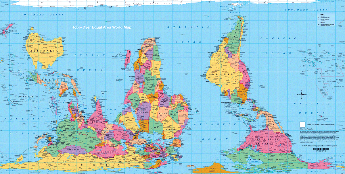
The Hobo-Dyer projection is another example of the cylindrical equal-area projection, but it aims to be more visually pleasing than the Peters projection. The map, created by Mick Dyer for ODT, is two-sided, with one side reversing north and south, as shown here, for additional perspective.
Americans are justifiably not famous for their profound interest in or knowledge of much of the rest of the world, in part because of our country’s vast size and relative isolation. We have two ocean borders, thousands of miles wide, and only two land borders. By contrast, Brazil has borders with every country in South America except two.
Better maps and greater attention to geography in our educational system would not be very expensive, but it could be very beneficial.
Note: ODT Maps is offering FSJ readers $25 worth of world maps free. Use the code “donation$25” when checking out of the ODT Maps store at https://ManyWaysToSeeTheWorld.org. Special thanks to ODT Maps Founder Bob Abramms for generously sharing the maps (ODTmaps.com).
Read More...
Related Links
Featured Content from This Issue:
COVER STORY: AFSA ANNUAL AWARDS 2018
FOCUS ON FSN PERSPECTIVES
- Through the Lens of an FSN: Foreign Service in Pictures
- Advocating for Foreign Service Nationals
- Get Ready for Merit-Based Compensation
- In the Field with USAID FSNs
- What Local Staff Want You to Know
MESSAGE FROM THE HILL
EDUCATION SUPPLEMENT
PERSPECTIVES
- President’s Views: Regaining Lost Ground
- Speaking Out: A Worldwide FSN Association at State: Advancing a Practical Dream
- Reflections: Maps Are Useful, But Can Be Misleading
AFSA NEWS